More on Color Theory and Looking to 2012
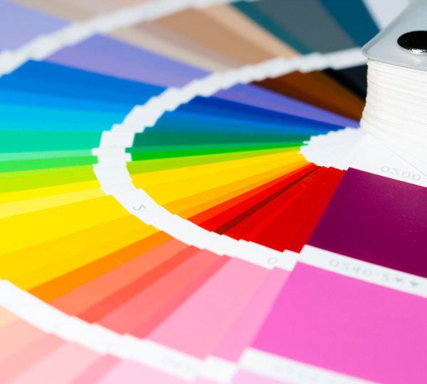 Although it is everywhere, color is an element that many people do not consciously think about. But its impact is enormous in all communication elements, from logo, to branding and trade dress, to collateral, to online and e-communications. And it helps set the emotion of each communication.
The whole concept of color theory has evolved over thousands of years (it certainly is not a new concept and it didn’t just “crop up” one day!). It started with cave drawings and images, and over time evolved as artists experimented and began making discoveries. Legendary artists such as da Vinci, Monet, and countless others have all left their mark on the evolution of color design, and provided important work in the development of color systems.
We, as designers, have learned from the masters in our more modern times to understand and appreciate the nuances of colors and combinations, and to best select colors to translate to a desired array of emotions. It is also a subject we are passionate about, as we enjoy sharing the implications of a palette with clients.
Each year, as the seasons change, we are all bombarded by a media blitz with lots of images of the latest fashion trends. Spring 2012 designers are inspired by diverse influences, showcasing a range of styles and lifestyles, from free and playful to contemporary and classical. Colors reflect these differing moods, and in the palette showcased for the coming year, we see a variety of vivid brights, soft muted tones and fun-loving pastels.
For a taste of the colors that are looking to shape design in 2012, we has selected some of the hues we think are especially fun and make us think of warmer days ahead:
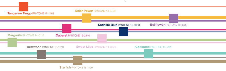
Tangerine Tango is an enticing orange shade (one might call it vivacious) and it certainly will enliven a design.
Providing a jolt of energy, Solar Power radiates warmth and cheer.
Bellflower is a distinct ornamental purple, and speaks to uniqueness and creativity.
Cabaret is a sensual and intense rosy-red (some might even say sexy) and reminds us of summer.
Sodalite Blue is a classic maritime hue, and brings calmness and a sense of order to a design.
Cockatoo, a spirited shade of blue-green, brings a touch of whimsy to the elements it touches.
Starfish is a versatile neutral that is warm just like the summer months that we know are somewhere ahead.
Inspiring, isn’t it? These are some pretty amazing colors – be on the lookout for them in the coming months!
And now is a perfect time to do a check in with us and make sure you are getting the greatest impact you can from your design. Sometimes a subtle difference – like the variation of a color palette - is all a design needs to bring about a greater impact and better connect your message with your target audience.
Drop us a note, give us a call at 608-257-6464, or follow us on Facebook to find out more about our thinking, our ideas, and what we see in the world of design.